![[AT-43 emblem]](img/at-43.png)
![[AT-43 emblem]](img/at-43.png)
This is an expanded and improved version of the original article, now with guides for Photoshop, Photoshop Elements and GIMP! You are now reading the one for Photoshop, but you can also read this article for the other programs: the navigation section at right lets you pick which version you want to read at any time.
Also updated are the templates — the Photoshop Elements template has been added in addition to those for GIMP and the full version of Photoshop!
As anyone who has played the game probably knows, AT-43 uses cards that show the statistics of units to determine the activation sequence in each turn of the game. However, there are some units that have been published for which no cards exist, and if you build a model yourself you will also need to make a card for it if you want it to be truly usable. This article explains how to make the card look like it actually belongs in the game.
Before you rush off to download the template and create a card, there are some things you should know. Most importantly: read the article before creating a card. Yes, you can just grab the template and get going, but before you do that there are some things you probably need to know about the way the file is set up, as well as about making cards in general. These things are explained in the article, and obviously, if you skip straight to the end, you will miss them.
The colors you see on the cards are not accurate compared to the cards Rackham makes. It is as simple as that, and in the follow paragraphs, I will explain why this is the case and why it is impossible to correct. Please do not send me e-mails or make forum posts to complain about the colors being wrong on a card you have made — if you do, you probably have not read this section. Colors on computers and printed material are a very complex subject. I cannot and will not claim to be an expert on it, but even if I was, I probably still would not be able to get them absolutely right.
The basic problem is differences in equipment. For example, a computer screen beames light at you while a printed card reflects light from the environment. This causes a difference in perceived color even if the two (on screen and on the card) are as similar as they can be. This partly explains why the printed card may look different from the one you designed — but we will get back to this in a moment.
Another part of the problem is differences in setup: what looks a certain color on my screen may appear different on yours. This is due to the way our screens have been adjusted: even if we have the exact same make and model of screen (you would need a 2008-model Apple iMac with 20″ screen, incidentally), you may have the brightness set higher or lower, causing differences in perceived color — and that is just a very simple way in which this may occur. It gets a lot more complicated when you figure in different models and manufacturers, and all possible settings of all of these: two different types of screen with the same settings will very likely produce different colors. A part of the way to avoid some of these problems is to calibrate your screen so that it shows colors as accurately as possible. However, good calibration requires a colorimeter, special equipment that hobbyists frequenty don't have access to, so they have to resort to less-accurate methods.
Still, each screen, as well as all other devices that work with color, such as scanners, printers, digital cameras, and so on each have their own little peculiarities that almost guarantee that no two ever show the exact same color when they need to. This is the other part of why the card you printed does not perfectly match the colors on your screen.
And that is the reason color management was invented. The way this works, more or less, is that every device has a color profile — a representation of the way it handles colors, which allows their capabilities to be compared and adjusted. This way, a color profile may be stored inside an image file, so that a program that opens the file can change the image's actual colors so that they will appear the same in that program as in the program that originally created the image. (Again, this is an oversimplification of what really happens.)
What's more, all of the above only works if you make it work. Yes, programs may automatically apply color profiles and/or warn you when they do so, but if you use a screen that is not properly calibrated, it all means nothing because the computer is not aware of the colors your screen actually displays.
To make this worse, I'll let you in on some secrets: I didn't create these cards on a properly-calibrated system, and I eyeballed various colors so they looked right
on my screen. This in itself pretty much negates any chance of cards that exactly match those by Rackham. Unless someone digs up the actual card blanks Rackham used, I'm afraid that if the colors seem wrong to you, your only recourse is to adjust them in your graphics program.
Before you can start designing cards, you will need some tools to put them together. The following sections explain what you need.
Although perhaps superfluous to mention, you will need a computer. Any fairly recent computer will do so long as a suitable graphics program is available for it (those will be covered below). You can do all the necessary work with a keyboard and mouse, though some things may be easier using a graphics tablet — but if you have one of those you probably do not need this guide, and in any case everything you can do with a tablet can also be done using a mouse.
The operating system you use on the computer does not matter much: whether you use Linux ![]() , Apple Mac OS X
, Apple Mac OS X ![]() , Microsoft Windows
, Microsoft Windows ![]() , or another system, graphics programs with the necessary capabilities are available for all modern systems. Different people have different preferences for their operating systems (or simply do not have experience with other systems than what they use for their daily computer needs), but this guide tries to cover all of the current
, or another system, graphics programs with the necessary capabilities are available for all modern systems. Different people have different preferences for their operating systems (or simply do not have experience with other systems than what they use for their daily computer needs), but this guide tries to cover all of the current big three
systems named above so that it will hopefully prove useful to most people instead of only those working with a specific system. By extension, with perhaps a little adaptation it should also be usable with most other operating systems.
There are different types of program you can use to make cards, but this guide shows how to do it using a graphics editor. A variety of these programs is available, some free, some costing a smaller or larger amount of money; a number of the more common choices are covered below.
| Operating systems | Retail price(1) | |||||
|---|---|---|---|---|---|---|
| Adobe Photoshop | US$699 | |||||
| Adobe Photoshop Elements | US$99.99 | |||||
| Corel PaintShop Photo Pro | US$69.99 or US$59.99 | |||||
| GIMP | Free | |||||
| Microsoft Paint | Free(2) | |||||
| Pixelmator | US$59 | |||||
| (1) As shown on the publisher's web site in Summer 2010. (2) Included with most versions of Microsoft Windows. | ||||||
Adobe Photoshop | |
|---|---|
This is the de facto standard for photo editing, though it is really much more powerful than necessary for what most people use it for. As it is also a very expensive program, it is probably out of reach of most gamers unless they have a realuse for it as well. This guide shows how to use Photoshop to create AT-43 cards. | |
| Web site: | |
Adobe Photoshop Elements | |
A bare-bonesversion of Photoshop, intended for hobbyists and amateurs who want to touch up photographs but do not need the full set of tools professionals use. This article shows how to create cards using Photoshop, but a version for Photoshop Elements is also available. | |
| Web site: | |
Corel PaintShop Photo Pro | |
PaintShop Photo Pro is the current incarnation of what used to be called Paint Shop Pro, a popular graphics editor for Windows in the 1990s. Like Adobe Photoshop Elements it is aimed at the hobbyist/amateur market rather than the professional one and so lacks some of the tools and options for professionaluse. This guide does not specifically cover PaintShop Photo Pro, but it should be similar enough to Photoshop that the techniques shown here can be used in much the same ways. Because PaintShop Photo Pro can open Photoshop files, you can use the template for that. | |
| Web site: | |
GIMP | |
| GIMP, or the GNU Image Manipulation Program, is an open-source application for working with images. It can do many of the things Photoshop can as well, but can be freely downloaded and used. If you have no graphics editor, GIMP is probably your best choice. This article shows how to create cards using Photoshop, but a version for GIMP is also available. | |
| Web site: | |
Microsoft Paint | |
| Paint is a very simple program that is supplied with every version of Microsoft Windows from 1.0 onward, and though it could be used to create cards, it is very limited and so should probably only be used as a last resort. Since GIMP, for example, is free, it is usually better to install that than rely on Paint if you are a Windows user. The reason it is mentioned here is because not everyone may be aware of Paint's limitations, and so might consider using it to make cards, probably only to find this will be a somewhat frustrating exercise. | |
| Web site: | |
Pixelmator | |
| This program is also aimed at hobbyist users, offering the common tools needed to work with images but not the extensive suite professional applications do. It is sufficient to create cards for AT-43 with, though. Although this guide does not specifically cover Pixelmator, it can open Photoshop Elements files, so you can use the template for that program. However, Pixelmator cannot edit the text layers of the template, so you will have to recreate these yourself. | |
| Web site: App Store: | |
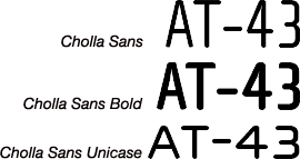
The font used on the original cards is Cholla Sans by Emigre, in the variants Wide and Unicase. A package containing these two plus two other variants costs US$95 to buy (Summer 2010), for the fonts in either Macintosh Postscript or Windows Postscript plus TrueType formats; however, if you use Mac OS X, choose the Windows variant because OS X cannot use Postscript fonts (unlike Mac OS up to and including version 9) but has no trouble with Windows TrueType fonts.
If you need modern typographic features you are better off buying one of the Cholla OpenType packages instead, even though these are more expensive at US$210 for one containing Wide and Unicase variants, plus bold and italic versions of the former.
However, there is an alternative to Cholla: WallaWalla, which can be downloaded for free. This is a good match for Cholla Wide Bold, and though it is not perfect it does have the advantage of being at least US$95 cheaper — plus, most people will likely not be able to tell the difference between it and Cholla anyway.
Note: Your web browser may inform you that the certificate for the site containing WallaWalla is not valid. This does not mean that you may be at risk of downloading a virus or other malicious software — instead, it means you should not send confidential information like passwords, bank account data or credit card numbers to the site. Since you are only there to download a font file, however, this should not be an issue.
How to install the fonts depends on your operating system (click on the ![]() symbol if you only see the name of your operating system but not the actual instructions):
symbol if you only see the name of your operating system but not the actual instructions):
sudo mkdir -p /usr/local/share/fonts/truetype/myfonts⏎ Returnsudo command will now prompt you for your password; type this in and press ⏎ Return, but note that you will not see anything appear on your screen when you type. Should the terminal then says you are not in the sudoers fileit means you cannot install the font in this directory — ask the system administrator for help. Also, be sure to know the security risks involved before using
sudo.sudo cp path/to/font/file /usr/local/share/fonts/truetype/myfonts⏎ Returnsudo unless you wait a long time after the previous commands.sudo fc-cache -fv⏎ Return%windir%\fonts and click the OK button;In 2007, the sand dealer made blank versions of cards for the Red Blok, Therians and U.N.A;. these could be downloaded from the French AT-43 forum when that was still operational; also available from this forum thread were a completely blank card and cards that are nearly blank but have room for the fighter's data.
Based on these cards, I have created a template that you can download at the bottom of this page. This contains most of the features you will find on AT-43 cards, giving you a good basis to create your own cards quickly, using the instructions that follow below.
You will also need a photograph of the model that the card is to represent. You can get one from many sources: for example from the Internet (such as the web site of the manufacturer of the model you are making a card for), or you can take one yourself — presumably, you already have a model that you want to use in AT-43.
If you want or need to take the model photo yourself, there are a few things to keep in mind. Please note that this is not an in-depth tutorial, but rather just some pointers to help you take usable photographs of models for making cards.
You will need a digital camera with macro mode, an adjustabe depth of field (also known as the f-stop) and for best results, an adjustable white balance as well. See the camera's manual for information on how to set these — you will never be able to get good photographs if you don't know what your camera can do and how to make it do that. A tripod to keep the camera steady is almost indispensable, as well as two or three lights and a neutral background to properly show the model. For the background, all you need is a sheet of colored paper (preferably larger than A4 or Letter size if you are taking pictures of models bigger than infantry fighters); you can get this at any stationer's or craft shop. Use a sheet that has a color which contrasts with the colors used on the model, as this will make separating the model from the background later on much easier. For example, a Therian model will usually be fairly dark, so a light background will be useful for these.
Set up the paper so it provides a total backdrop to the model; it does not need to fill the entire picture, but it should be visible all around the model when you look through the camera's viewfinder, or at its screen. It is easy to keep the paper in place by setting up the model on it and then curving the paper up against a wall, pile of books, or similar solid object behind it. In case of a lightweight model, such as an infantry soldier, you can place an additional weight on the paper or clamp it to the edge of the table (in such a way that the model is not obscured, of course).
Use the lights to illuminate the model from both sides and/or above: move them until you have few or no shadows on and around the model when seen through the camera. This is the reason for using more than one light: that way, you can use each to cancel out the obvious shadows created by the other(s).
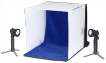
An alternative to the colored paper backdrop is to buy a portable photography studio. This typically includes a cloth background as well as white cloth curtains
on the sides and top, through which you can shine the lights so they will be diffuse and cast less-harsh shadows.
Now you will need to set the camera's white balance; refer to the camera's instruction booklet to find out how to do this. The reason is that setting the white balance tells the camera what white looks like in the set-up you use, so that it can adjust the colors on the model to compensate for the color of the lights you actually use. Without this step, colors are likely to be off: a normal light bulb, for example, casts yellowish light while fluorescent light is blueish, so the model in the photo would appear much more yellow or blue than it would if you photographed it in sunlight.
Set the highest depth of field the camera will allow and then focus on the model from a fairly short distance; using macro mode is usually necessary to get the model in focus. All that remains is to take a photograph, repeating with a few changes to the camera settings, light positions, etc. if necessary until you get a picture you like. Take your time here, because it will make all the difference between getting a good, usable photo and one that is barely adequate. Especially important is to try and avoid (or at least reduce to a minimum) shadows directly around the model, because these will require the most work to remove later on.
Once the card is finished, you will need to print it out for use, and that obviously requires a printer. If you have a computer, you probably already have a printer, too, but in case you don't or you were looking to buy a new one anyway, it is recommended you go for a good-quality inkjet photo printer. These are made by a range of manufacturers, of which some of the best-known are Brother, Canon, Epson, HP and Lexmark, though these are by far not the only ones. Their printers are all fairly comparable, so it is very much a matter of doing some homework on the Internet before making your choice. One pretty important thing to keep an eye on is the printer's ink consumption, and also that it has separate ink tanks for each color. Printer ink is expensive, and if you can replace individual colors as needed, you will waste a lot less money.
Another option is a color laser printer, but these are not that great for printing photos, and since AT-43 cards feature a prominent photo it is probably better to use an inkjet for your cards. Inkjets are also cheaper to buy than laser printers, though the cost per page of a laser printer is lower.
Now the tools have been sorted out, it is time to show how to actually make cards.
Although this guide shows Adobe Photoshop being used, the methods illustrated should work in most other programs as well. If you use a different program, a version of this article may also available be available for that by using the icons in the sidebar at right.
In other programs still, some things may look a little different than shown here, but the basics will be much the same: tools and options may have different names or symbols, or be found in other locations in the program you use. If you cannot find something, have a close look at the program's tools and menus, and when all else fails, RTFM. Similarly, screenshots are all of the Mac version of Photoshop, but versions for other operating systems should look much the same.
Also, the font WallaWalla is used in the template instead of Cholla.
The template uses layers to hold a variety of images and bits of text that together make up a card. This is so that the various armies and options can be catered for in a single file: all you need to do is make the layers you want visible, and hide all the ones you don't need. If you are not used to working with layers, it may help to think of them as transparent sheets of plastic with images on them, that you can lay over a basic illustration to change what it looks like.
Make sure the layers palette of your graphics editor is visible: in Photoshop, you can show it by clicking on the menu and then selecting , or by pressing F7. This reveals the window shown below:
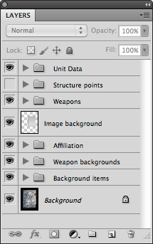
This window, or palette, shows all the layers in the image, as well as layer groups. In front of each layer's name is a tiny version of what is actually on the layer, while layer groups have a disclosure triangle and a folder icon instead: — clicking on the triangle will show the contents of the layer group. A group can contain layers and/or more groups.
To the left of the icons may or may not be a small square with an eye symbol ![]() . If there is none, the layer or layer group is hidden — it will not be visible in the image — while if a
. If there is none, the layer or layer group is hidden — it will not be visible in the image — while if a ![]() is shown, the layer is visible. Click an empty square to display the
is shown, the layer is visible. Click an empty square to display the ![]() and make the layer or layer group visible, and click on that symbol to hide the layer or group. Layers within a group can be set as visible or hidden, but will only be actually visible if the group is visible as well; this provides a quick way to show or hide multiple layers, and is one of the reasons for using layer groups in the template.
and make the layer or layer group visible, and click on that symbol to hide the layer or group. Layers within a group can be set as visible or hidden, but will only be actually visible if the group is visible as well; this provides a quick way to show or hide multiple layers, and is one of the reasons for using layer groups in the template.
Layers can be moved around inside the image, so you can change the position of what is on the layer relative to the rest of the image. To do this, select the ![]() Move tool in Photoshop's tool bar. Next, in the Layers palette, click on the layer you want to move, then click anywhere in the image and keep your mouse button pressed down. Moving the mouse will now move the layer; when it is where you want it, let go of the mouse button. You can also use the arrow keys on your keyboard to move the layer in small steps so you can position it more accurately.
Move tool in Photoshop's tool bar. Next, in the Layers palette, click on the layer you want to move, then click anywhere in the image and keep your mouse button pressed down. Moving the mouse will now move the layer; when it is where you want it, let go of the mouse button. You can also use the arrow keys on your keyboard to move the layer in small steps so you can position it more accurately.
Beware that you can move the layer outside the visible part of the image — this will clearly make the layer invisible and difficult to get back inside
the image, so you may need to press ⌘Z (Mac) or Ctrl+Z (Windows) to undo the move. Also note that if your mouse cursor moves outside the image's window and you release the mouse button, the layer will snap back to where it was before you started moving it.
When you need more than one of a certain layer, you can duplicate (copy) it. Click on the layer's name in the Layers palette to make sure it is selected. Then open the menu, and from that, choose so that the Duplicate Layer window appears. In this, you can type a name for the new layer if you want, and then click the OK button to make a copy of the layer you had selected.
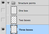 +
+
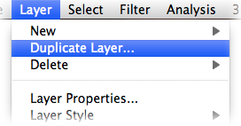 →
→
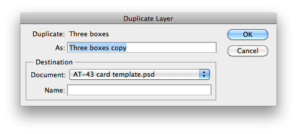 →
→
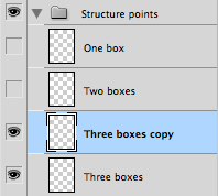
You will likely not see the duplicated layer in the image because it will be in exactly the same position as the original. To remedy this, move the layer as described above.
First of all, open the photo of your model. You will need to cut out
the model from its backdrop, and you can do this by selecting the backdrop and turning it into a layer mask. The next sections show how to do these things. To illustrate, we will use a picture of a grim golem overseer model, pictured below in a Photoshop window:
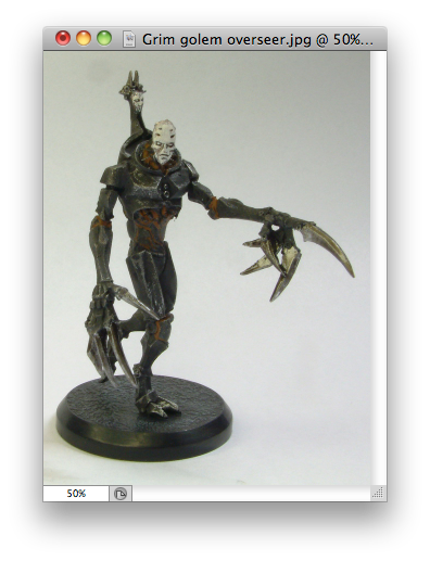
You should have photographed the model against a neutral backdrop, preferably of one color that contrasts with those on the model. This will make it easy to select the backdrop: click on the ![]() magic wand tool in the toolbar and then in the button bar, set Tolerance to 20 and make sure both Anti-Alias and Contiguous are checked:
magic wand tool in the toolbar and then in the button bar, set Tolerance to 20 and make sure both Anti-Alias and Contiguous are checked:
(Anti-alias means the selection will have smooth rather than ragged edges, and contiguous will prevent areas that are separate from each other being selected just because they have the same color.)
Now click anywhere in a neutral part of the photo's backdrop. If all goes well, you should see most or even all of the background become selected (that is, it will get a border of black-and-white marching
dashes). This works because the magic wand tool selects all parts of the image that have more or less the same color as the one you clicked on, using the Tolerance to determine how close two colors need to be: with Tolerance 0, only exactly the same color nearby is selected, while at 255 (the maximum) the whole image will be selected. We use 20 here because that is often a good starting point — but experience will be your best guide in this, so try some different numbers in different photos, and see what happens.
You could select the model itself instead of its backdrop, but this is not a smart idea: the model will have different colors, as well as shapes that cause shadows, all of which make it hard to select the model using the tools graphics programs provide. The whole purpose of using a neutral-colored backdrop is to make it easy to select by being (almost) a single color that differs from that used on the model.
The following is the result when trying the magic wand tool on the grim golem overseer, using the settings shown above, clicking more or less in the center of the image below his outstretched arm:

As you can see, it has not selected all of the backdrop, because this actually has quite a large variation in colors, from reasonably dark at the top to much lighter at the bottom (this is a result of not lighting the model well enough when taking the picture — the moral of the story is not to rush things for an article).
If not enough of the backdrop has been selected, you have a few options, in no particular order of preference:
paintin an unselected part of the image by clicking and keeping the mouse button down, then moving the mouse; this will expand the selection in a similar way to the magic wand tool, but is a bit more controllable because it will only select colors near where the mouse cursor is;
Similarly, if you find you have selected too much, you can remove part of the selection as follows:
The important thing to know about all these selection tools is that you need to get a feel for how they work — basically, practice makes perfect. For more information on selecting parts of an image, see Photoshop help at the Adobe web site.
By using only the magic wand and clicking in unselected areas while keeping the ⇧ Shift key pressed, the whole backdrop of the overseer can be selected in short order:
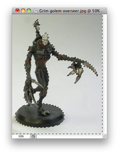
Be sure to also select enclosed
areas! For example, with most infantry figures and striders, part of the background will be visible between the model's legs, but this will usually not be selected if you focus on the background around the model. You will need to include such parts that are completely enclosed by the model in the selection as well, else the card will look like you did a poor job at making it.
If you look at the example above, you can see that all kinds of areas are not selected: between the right arm and body, between the right thumb and leg, between the two legs, between various fingers, and more. By simply using the magic wand tool again on all of these areas, while keeping ⇧ Shift pressed, this is easily fixed:

Once you are satisfied that you have selected the backdrop but not the model, it is time to prepare for putting the model photo onto the card. The first step in doing this is to turn the image background (not the photo backdrop) into a layer. This is necessary because Photoshop images can have both layers and a background
which is kind of like a layer, but not quite — most importantly, the background cannot be transparent, but we need that so the model will look good on the card.
To do this, click on the menu, then on the option, and then the option as shown below:
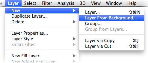
A window will appear, in which you can simply click the OK button.
Now to remove the backdrop of the photo. The easiest way to do this is to create a layer mask
— that is, telling the program that you do no want to see the selected areas, without actually removing them from the image. This way, you can later always remove the mask and have the original image back, which would be impossible if you made the selected areas transparent.
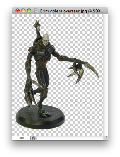
Again click on the menu, but now choose and then , like so:

The backdrop will disappear from your photo, to be replaced by a chequer pattern to indicate the transparent parts of the image:
You are now pretty much done with the model photo — time to put it onto a card!
Once you have your model photo ready, open the card template in Photoshop. This will open it in the same window as your model photo, and tabs will appear along the top (this may differ in the Windows version of the program, and also in earlier versions than Photoshop CS4 for Mac). Make sure the card is being displayed — if it is not, click on its tab or window. You can now proceed to make the actual card.
The template file contains a layer with information about the file: what it is, copyright and distribution information, etc. This is the top-most layer in the Layers window, and has the name Information. You will probably want to hide this layer, as it is really only there to claim
the template and gets in the way otherwise.
The first thing to do is see if the model needs a background or not. Type ★ and ★★ soldiers normally have a gray, almost rectangular background to the image; type ★★★ soldiers and vehicles do not. So, for type ★ and ★★ soldiers, make the layer Image background visible, and a gray area will appear on the card:
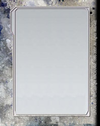
Now, click on the layer titled Image background so that it becomes pale blue. Switch back to the image of your model, and select the ![]() Move tool in Photoshop's toolbox. Click anywhere inside the image and keep the mouse button pressed, then move the mouse: you are now dragging the image. Move your mouse pointer to the tab of the card template and keep it there until the card becomes visible; then move your mouse pointer to somewhere inside the image and let go of the mouse button. (If your images open in different windows, drag the model photo to the window with the card template and release the mouse button.)
Move tool in Photoshop's toolbox. Click anywhere inside the image and keep the mouse button pressed, then move the mouse: you are now dragging the image. Move your mouse pointer to the tab of the card template and keep it there until the card becomes visible; then move your mouse pointer to somewhere inside the image and let go of the mouse button. (If your images open in different windows, drag the model photo to the window with the card template and release the mouse button.)
This will create a new layer in the Layers palette, directly above the layer Image background, and that new layer holds the photo. It is possible for the layer to be in another position in the layers palette; if so, then in that palette you can simply click on the layer you just created, keep the mouse button pressed, and drag the layer up or down so it is directly above Image background.
Once the layer is in the right position, the card will look much like this:
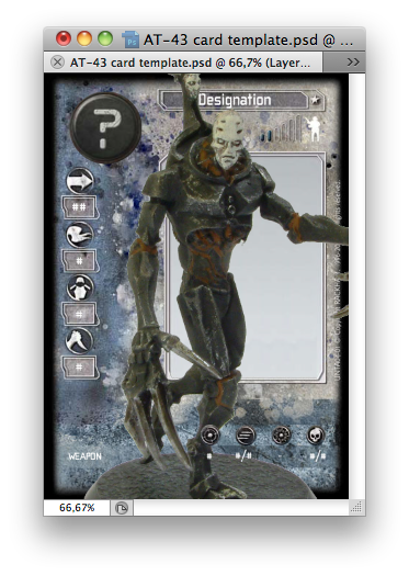
The model photo will likely be far too big to fit on the card, as can be seen in the example above. This can be fixed easily by making sure the layer holding the model photo is selected in the Layers window, clicking on the menu, then choose → :

A rectangle will appear around the model image, though you may not see it if it falls outside the edges of the card. This is not really a problem — take a look at the toolbar at the top of your screen:
First, make sure the chain
button between the W
-field and the H
-field is pressed in, like in the toolbar shown above. This will link these two, so that if you scale the image in one direction, the other will follow along. Now make an estimate of how much too big the photo is, and type a percentage in either the W
-field or the H
-field to reflect that. For example, if you think your image is about four times bigger than it should be, type 25% in one of these fields. If it is still too large, shrink it further by erasing that number and typing a lower one still. The object right now is to simply get all of the model inside the card template, not to make it fit perfectly just yet.
You may now notice little squares at the corners and centers of the lines around the model, as shown in the image below. Click on one of these and drag it to the side or up and down: the model photo will become larger or smaller as you do so. You can also click on the model photo and drag it around to change the model's position on the card. Do both of these until the model's position and size look right to you, and when you are satisfied, click the ![]() button in the toolbar at the top. (Should you want to start again, click the
button in the toolbar at the top. (Should you want to start again, click the ![]() button or press the Esc key on your keyboard instead — this will give you back the image as it was before you starting changing its size.)
button or press the Esc key on your keyboard instead — this will give you back the image as it was before you starting changing its size.)
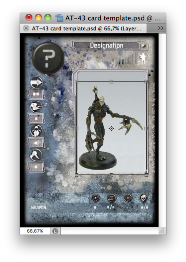
Keep in mind that if you use the gray background, the model should not overlap its inner border, let alone stick outside the background! With vehicles, you can let the game statistics overlap the model photo, as some of Rackham's cards do this as well, but it should only be done if the vehicle photo would become too small otherwise, and even then it is probably best to let only the officer data overlap the photo. You might also have to take a new photo from another angle if it turns out the model appears very small on the card, for example if there is a large amount of room left above and/or below the picture.
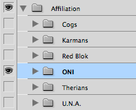
To determine the affilitation of the unit, unfold Affiliation and make the subgroup for your desired affiliation ![]() visible. This will show the relevant emblem in place of the generic one (the black disc with a question mark) and for some armies also apply a color overlay to the card.
visible. This will show the relevant emblem in place of the generic one (the black disc with a question mark) and for some armies also apply a color overlay to the card.
 →
→
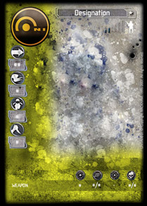
This is the part where the game statistics and other data are entered.
To add the fighter's game statistics to the card, click on the ![]() button in Photoshop's tool bar to activate the text function (if this button is not showing, look for either a similar one with a downward arrow next to the letter T, or outline versions of either, then click on the small triangle in the lower right corner so you can select the right tool as shown above). Next, click on the text Designation at the top of the card and you will be able to edit it so you can type the appropriate name there. It is easy to mis-click, so try to position the cursor actually on a letter when you click; you can recognize that you have clicked right if a dark line appears underneath the text and a blinking cursor shows inside the text near where you clicked, like so:
button in Photoshop's tool bar to activate the text function (if this button is not showing, look for either a similar one with a downward arrow next to the letter T, or outline versions of either, then click on the small triangle in the lower right corner so you can select the right tool as shown above). Next, click on the text Designation at the top of the card and you will be able to edit it so you can type the appropriate name there. It is easy to mis-click, so try to position the cursor actually on a letter when you click; you can recognize that you have clicked right if a dark line appears underneath the text and a blinking cursor shows inside the text near where you clicked, like so:
(You may have to look carefully at the image above, because it is not that clearly visible.)
Once you are happy with the changes, look at the top button bar in Photoshop; it will show this button: ![]() . Click on it to make your changes permanent; if you do not want to keep them after all, click
. Click on it to make your changes permanent; if you do not want to keep them after all, click ![]() or press the Esc key on your keyboard instead.
or press the Esc key on your keyboard instead.
Repeat the above for all other statistics the unit, fighter or vehicle has. The ![]() Speed,
Speed, ![]() Morale,
Morale, ![]() Protection and
Protection and ![]() Combat entries use hash marks (#) as placeholders, so just click on those with the text tool to change them.
Combat entries use hash marks (#) as placeholders, so just click on those with the text tool to change them.
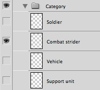
In the group Unit data Category, make ![]() visible the layer that matches the type of fighter represented by the card. Hide all others to avoid clashes.
visible the layer that matches the type of fighter represented by the card. Hide all others to avoid clashes.
 →
→

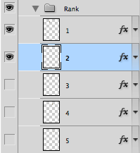
You set the card's Rank in Unit data Rank, where there are five layers (conveniently numbered 1 through 5); each of these represents one rank chevron on the card. Make ![]() visible all the layers up to and including the one for the rank you need — for example, if you are making a card for a Cog G18 officer (that is, rank 2), you would need to make layers 1 and 2 visible. Perhaps unnecessary to mention, you need to hide all the Rank layers for fighters that have no rank; this is easiest to achieve by simply hiding the whole Rank group.
visible all the layers up to and including the one for the rank you need — for example, if you are making a card for a Cog G18 officer (that is, rank 2), you would need to make layers 1 and 2 visible. Perhaps unnecessary to mention, you need to hide all the Rank layers for fighters that have no rank; this is easiest to achieve by simply hiding the whole Rank group.
 →
→

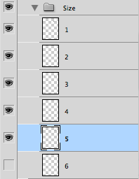
Setting the fighter's Size works almost exactly the same as the rank, except you need to set it in Unit data Size.
 →
→

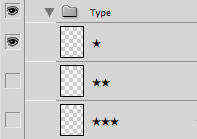
The fighter's type (★, ★★ or ★★★) is set in the same way as the category, but in the Unit data Type group. Again you should hide all the layers except the one that actually shows the unit's type, in this case because the layers cover each other so only the top-most one (with the fewest stars) will actually be visible.
 →
→
If the card represents an officer, you must set the Unit data Officer data groups to be ![]() visible. Then simply edit the values as shown above for the normal unit data.
visible. Then simply edit the values as shown above for the normal unit data.

This works exactly the same as making the card show officer data, but you must set the group Unit data Transport capacity to be ![]() visible.
visible.

To include data for the fighter's weapon(s), first decide how many weapons should be listed. Most soldiers will have one or two weapons, while a card for a squad will probably list two weapons plus a special weapon. Rackham cards typically include only one special weapon per card, even if the unit has different ones to choose from: U.N.A. Steel Troopers, for example, have separate cards for the missile launcher, the laser gun and the Volcano MG. By the same token, officer cards list only the basic weapons of the unit, not any special weapons their unit may have. Some vehicles have weapons that fire into the forward arc plus weapons that fire in the rear arc, and these are listed separately as well.
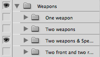
All of these call for slightly different weapon options on the card. Go to Weapons and set the visibility of the layer that suits your needs for the unit. For example, for an officer armed with a single weapon you can show the One weapon group, while a unit whose fighters are armed with a rifle and a close-combat weapon plus a special weapon would use the Two weapons & Special group; that last one is also suitable for a vehicle with two front-mounted and one rear-mounted weapons.
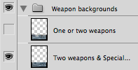
In Weapon backgrounds, you must also make ![]() visible the appropriate icons and background for the number of weapons you have selected. This has two reasons: one is because three or four weapons require more room than one or two weapons, and the other is that some affiliations cause a color overlay to be added, and this must also be applied to the weapons background, but not to the actual weapon data and icons. As such, the weapon background layers are below the color overlay, while the weapon data layers and icons are above it. This has the minor inconvenience that you must ensure the visibility of three layers or layer groups instead of just one.
visible the appropriate icons and background for the number of weapons you have selected. This has two reasons: one is because three or four weapons require more room than one or two weapons, and the other is that some affiliations cause a color overlay to be added, and this must also be applied to the weapons background, but not to the actual weapon data and icons. As such, the weapon background layers are below the color overlay, while the weapon data layers and icons are above it. This has the minor inconvenience that you must ensure the visibility of three layers or layer groups instead of just one.
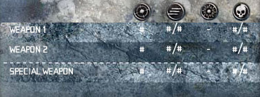
To add the weapon's game statistics to the card, click on the ![]() button in Photoshop's tool bar and then edit the text for each game statistic, just like for unit data as shown above.
button in Photoshop's tool bar and then edit the text for each game statistic, just like for unit data as shown above.
Vehicles, regardless of their type, also need structure points in at least two, and possibly more, locations. To add these, you will first of all need to determine how many Structure Points each part of the vehicle (Propulsion, Frame, and each weapon) needs. Next, set the Structure points layer group to be ![]() visible, then click on the triangle to show the group's contents. These consist of a number of layers, each with one or more white boxes on them to represent the structure points. Then, make
visible, then click on the triangle to show the group's contents. These consist of a number of layers, each with one or more white boxes on them to represent the structure points. Then, make ![]() visible the layers with the required number of boxes. For example, if your vehicle has 2 S.P. in its Propulsion, 4 S.P. in its Frame, and one weapon of 1 S.P., you would set those layers to be visible. (See Duplicating layers, above if you need more than one of a certain type — for instance, when the vehicle has two weapons with 1 S.P. each.)
visible the layers with the required number of boxes. For example, if your vehicle has 2 S.P. in its Propulsion, 4 S.P. in its Frame, and one weapon of 1 S.P., you would set those layers to be visible. (See Duplicating layers, above if you need more than one of a certain type — for instance, when the vehicle has two weapons with 1 S.P. each.)
The structure boxes are probably not displayed in the right places; to put them where they should be, see Moving layers, above. Something to keep in mind when positioning the S.P. boxes, is that you should put them in locations where it is obvious what part of the vehicle they are for, but at the same time, you need to clearly separate boxes for different components. For example, if the vehicle has two weapons side-by-side, each with 2 S.P., you would need to place two boxes on or right next to each weapon, but not in such a way that it looks like a single block of four boxes. You may also want to place the boxes in such a way that they do not obscure too much of the vehicle's photograph.
| Mac | Windows | |
|---|---|---|
| Save | ⌘S | Ctrl+S |
| Save As | ⇧⌘S | Shift+Ctrl+S |
Always save your work at regular intervals! This will prevent you having to do it all again in case there is some kind of trouble, like a computer crash or power failure.
When using a template, the first time you save your card, be sure to do so under a new filename by clicking on the menu and then — don't overwrite the template!
For your own use, it is best to always save the file in Photoshop format, because this way, all the layers etc. will be preserved, allowing you to open the image later and change it. If you use another format, such as JPEG, the layers may all get squashed together, and there is no way to get them back when that happens.
When you're happy with the card you've made, you may want to share it with the rest of the world. We will not cover exactly how to do that here, except to give some pointers as how best to save the file. For starters, do not put a Photoshop document on a web site unless you want to share it specifically with users of that program. The main reason for this is that it will be much too large for many people to comfortably download — for example, the card template as a Photoshop file is about 4 megabytes large, while the same image saved as a JPEG file can be as small as 100 kilobytes while still looking good. Second, most people will need to install a program to actually open the file — although Mac users can view Photoshop files in Preview and most other Unix users in GIMP without any real problems, the majority of Windows users are not so lucky and will probably have to find (read: buy
) a suitable program first.
For this reason, save a copy of your card as a JPEG file if you want to upload it to the world wide web. To do this in Photoshop, click on the menu, followed by to open a new window in which you can select exactly how to save the image. It is best to choose JPEG format, with a Quality of about 70; also check the box labeled Progressive
as this will make the image display more easily when it is being downloaded. Then just click Save and supply a filename.
Printing out the card is basically as simple as clicking on → in Photoshop (or by pressing ⌘P on a Mac or Ctrl+P under Windows). If you then simply click the Print button, a copy of the card will roll out of your printer.
The card template is set up so it prints out at the same size as Rackham's cards, namely 63 mm wide and 88 mm high. (For the resolution-conscious, this gives the card 151 μm dot spacing/168 dpi/66 dpcm — not professional print quality, but it should be good enough for gaming.)
Just printing out the card, though, puts it in the middle of the sheet of paper, essentially wasting all the rest of the page. Some people may not find this a problem, but you can easily print the image elsewhere on the page. To do this, uncheck the box Center Image in the Print window, as shown below:
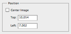
You can either use the Position text boxes to type the exact position you want to print the card at, or use your mouse to drag the card to where you want it on the white area on the left side of the Print window.
You can print up to nine cards on a single sheet of A4- or Letter-size paper by feeding it back into the printer after you have printed out one card, and then positioning the next card so it will end up beside the last one. The table below shows where to position the cards for this, with the whole block neatly centered on the page and with narrow white lines left between the cards to show where to cut. Metric measurements are given for A4-size paper, while for Letter paper, Imperial measurements are supplied.
| Card number | A4-size paper | Letter paper | ||
|---|---|---|---|---|
| Top | Left | Top | Left | |
| 1 | 1.575 cm | 0.975 cm | 0.25″ | 0.5″ |
| 2 | 1.575 cm | 7.325 cm | 0.25″ | 3″ |
| 3 | 1.575 cm | 13.675 cm | 0.25″ | 5.5″ |
| 4 | 10.425 cm | 0.975 cm | 3.75″ | 0.5″ |
| 5 | 10.425 cm | 7.325 cm | 3.75″ | 3″ |
| 6 | 10.425 cm | 13.675 cm | 3.75″ | 5.5″ |
| 7 | 19.275 cm | 0.975 cm | 7.25″ | 0.5″ |
| 8 | 19.275 cm | 7.325 cm | 7.25″ | 3″ |
| 9 | 19.275 cm | 13.675 cm | 7.25″ | 5.5″ |
Obviously you should not cut the cards out before you have printed all the ones you want on the sheet, and you will need to work out which way round to put the paper back into the printer so that you can print on the same side of the page again. This varies per printer, so the best advice is to first look in the printer's manual, and if that does not given an answer, to experiment: make a small pencil mark near the short side of a page, put it into the printer and note which way round you put it, then see which way it comes out of the printer again. This should tell you which side will get printed on, and where the top and bottom of the page are when it is still in the printer's paper bin.
If you print the card on regular paper, it will be difficult to game with. For starters, the back will be blank, so it will be very easy for your opponent to spot the card that represents your custom model or unit. Also, standard printing paper is much thinner than the original cards, making it difficult to handle during the game. There are two easy solutions: print on thicker paper, or back the print-out with another card. Both require card sleeves for best results.
Normal printer or copier paper is 80 grams per square meter in most of the world except North America, but to use the card in a game, at least two or three times that is needed to make the card sturdy enough for handling. The problem is that many printers cannot feed thick paper through their mechanisms, so be sure to check your printer's manual for the maximum paper density (also known as paper weight
) it can reliably use, and buy some of that.
This still leaves the back of the card blank, and although it is possible to print a scan of an official AT-43 card onto the reverse of the paper, this is often easier said than done — not to mention that it is likely to create a color difference between the printed card and the real
ones. A simpler solution is to buy card sleeves with an opaque back and put all your AT-43 cards into them — that is, the original ones as well as your printed version. This makes it hard for an opponent to spot which cards are which.
An even simpler way is to print the card on normal paper and then put it into a card sleeve with an original AT-43 card. If you cut the printed card to slightly smaller dimensions than the original one, it will be as good as invisible when the back of the card is showing. If you use sleeves with an opaque back, you can even use cards for completely different games — you could, for example, use a Confrontation card, a regular playing card, or even that spare M:tG flower you have kicking around and don't know what to do with.
This image has been created in Photoshop CS5, but will also open in CS4 (and possibly earlier versions, but this has not been tested). Photoshop Elements can open this template but it cannot access the contents of layer groups, rendering the whole thing almost unusable. GIMP can also open this file, but layer groups will be lost and text layers will not be editable, requiring some additional work to make it actually useful. Pixelmator can open this template as well, and though layer groups will be preserved, text layers will not be editable.
File Size: 2.3 MB (2271337 bytes)
MD5 checksum: 0c660a944e1d8c09b58978dbcc0d61bf
This is a GIMP image file that can be used as a template to create cards. It was made by opening the Photoshop template in GIMP 2.6.9 and modifying it so it can be properly used in GIMP. The file should open in later and possibly earlier versions of GIMP as well, though again, this has not been tested.
If you want to use this file as a true template in GIMP, open the image and click on the menu followed by then supply a name such as AT-43 card
or whatever else you like. You can then easily create a new card by clicking → and choosing the card from the Template list.
File Size: 1.4 MB (1440576 bytes)
MD5 checksum: cd390afc3207155d2df050093a97f98f