![[AT-43 emblem]](img/at-43.png)
A detailed look at how AT-43 books are laid out. The information in this article should be sufficient to create fairly good imitations of the books, though you should probably also measure them up yourself if you want to copy them accurately.
Note that the article assumes you are at least somewhat familiar with formatting text and desktop publishing. If you don't know the difference between a regular and an italic typeface, for example, or what a point is, pretty much everything here will probably go over your head.
Also included on this page are templates that will let you create AT-43-like documents yourself much more easily.
This section covers the fonts or typefaces used by Rackham to set the AT-43 books.
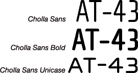
This font is available commercially from Emigre, the foundry that designed it. Although many different styles and weights are sold, Rackham really only uses the bold, regular and unicase variants. This last one mixes lower-case and upper-case letters, making it rather distinctive.
Buy & download: www.emigre.com/EF.php?fid=84

Helvetica Neue (also known as Neue Helvetica) is a commercial typeface marketed by Linotype. Nearly all text in AT-43 books is set in the Light and Light Italic variants of it, with Medium, Regular Italic and Thin being used for certain sections.
Buy & download: www.linotype.com/1266/neueHelvetica-family.html
MS Sansor
MS Sans Serif, as it matches the Helvetica family more closely than Arial does. (Mac OS X 10.5 and later also have these fonts installed as standard, though they are not really a good choice because the Helvetica variants are available just as easily.)
Neuropol X Free is, as the name suggests, a free version of the Neuropol X font family by Typodermic. Although you could use one of the commercial variants of the font, Rackham uses the free version only, which can be readily downloaded.
Download: www.dafont.com/neuropol-x-free.font
The table below shows what the typefaces mentioned above are used for in AT-43 books.
| Element | Font size & name | Alternatives (in order of preference) | Style | Justification |
|---|---|---|---|---|
| Chapter title | 32-point Neuropol X Free | Neuropol X Neuropolitical Xenotron | Regular; all capitals | Centered |
| Chapter fluff | 10-point Helvetica Neue | Helvetica Nimbus Sans Microsoft Sans Serif (MS Sans) Arial | Light Italic | Justified left |
| Examples | 9-point Helvetica Neue | Helvetica Nimbus Sans Microsoft Sans Serif (MS Sans) Arial | Light Italic | Justified left |
| Headers (level 1) | 12-point Neuropol X Free | Neuropol X Neuropolitical Xenotron | Regular; all capitals; 1-point rule 1.5 mm below text | Centered |
| Headers (level 2) | 10-point Neuropol X Free | Neuropol X Neuropolitical Xenotron | Regular | Centered |
| Headers (level 3) | 9-point Helvetica Neue | Helvetica Nimbus Sans Microsoft Sans Serif (MS Sans) Arial | Heavy | Justified left |
| Main text | 9-point Helvetica Neue | Helvetica Nimbus Sans Microsoft Sans Serif (MS Sans) Arial | Light Regular | Justified left |
| Numbers etc. on Photos | 11-point Cholla Sans | WallaWalla Digital Sans | Normal | — |
| Photo captions | 9-point Helvetica Neue | Helvetica Nimbus Sans Microsoft Sans Serif (MS Sans) Arial | Italic | Justified left or aligned right |
| Quotes | 9-point Helvetica Neue | Helvetica Nimbus Sans Microsoft Sans Serif (MS Sans) Arial | Light Italic | Justified left (last line aligned right) |
| Table headers | 10-point Neuropol X Free | Neuropol X Neuropolitical Xenotron | Regular | Centered |
| Table text | 9-point Cholla Sans | WallaWalla Digital Sans | Bold | Centered |
| Table of Contents | 9-point Helvetica Neue | Helvetica Nimbus Sans Microsoft Sans Serif (MS Sans) Arial | Thin Regular | Justified left |
| Text box headers | 10-point Neuropol X Free | Neuropol X Neuropolitical Xenotron | Regular; all capitals | Centered |
The information above was easily determined by opening the PDF file of the AT-43 rulebook in Adobe Acrobat Pro and using its touchup text tool (Tools → Advanced Editing → TouchUp Text Tool) to get information about the text, as shown below:
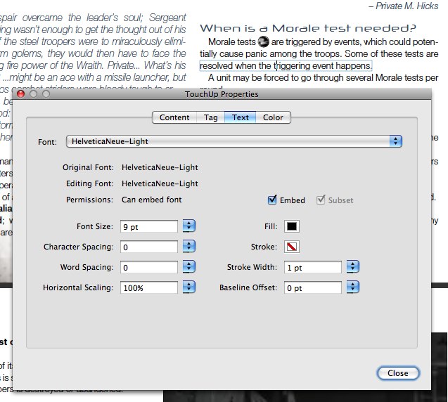
Then it was only a matter of going through the document and clicking on different pieces of text to find out their basic font settings.
This section covers the basic measurements of the books.
The pages of AT-43 books are 21 cm × 27.4 cm in size. This is the same width as a sheet of A4 paper, but shorter than that by 2.5 cm; it is also 5.9 mm narrower and 5.4 mm shorter than Letter-size paper.
What this means is that a document laid out to the size of an AT-43 book will print out on both A4- and Letter-size paper without the need to reduce it in size to fit everything on the page. (This assumes the printer used is able to print as closely to the paper's edge as needed, or that you don't care about the edges of the printed pages being clipped by the printer's margins.)
The actual margins in the AT-43 books vary somewhat because books are printed on paper that is larger than their actual page size, and are then trimmed to size. However, it appears they are as follows:
| Margin | |
|---|---|
| Top | 1.7 cm |
| Bottom | 1.7 cm |
| Inside | 2.5 cm |
| Outside | 1.5 cm |
This gives a text area of 17 cm × 24 cm.
Each page has two equal-sized columns with a 5-mm space between them; this makes each column 8.25 cm wide.
Pages are decorated with lines and images. The lines are most likely 0.5 points thick. On each left (even) page is a vertical line 1 cm from the left paper edge, 24.7 cm long and vertically centered on the page. A similar line appears on each right (odd) page, 1 cm from the right edge but running the full length of the page. Both left and right pages have a short horizontal line, about 3 mm long and vertically located in the middle of the page, with its outside tip against the outer edge of the paper.
In the top left corner of each right page and the top right corner of each left page appear two crossed lines, a vertical one of 3.7 cm long and a horizontal one 2.8 cm long. The top of the vertical line is 5 mm from the top edge of the page while horizontally, it is 2 cm from the inner edge of the page. The horizontal line is located 1.3 cm from the top edge of the page, with its inner tip 1.2 cm from the inner paper edge.
An image of a screw head, some 5 mm in diameter, is centred on the point where the lines in the upper corners of the page cross. These also appear on each of the vertical lines near the outer edge of the page, horizontally centered on the line, while is vertical position is such that its center is at the same height as the small horizontal line on the edge of the page. The screw head has a small drop shadow, about 0.5 mm in size to its lower right (135°).
The left page has two images, one 1 cm wide, with its top left corner in the op left corner of the page. It probably extends all the way to the bottom of the page, but it normally consists of a very pale color at the top of the page that fades to white somewhere before it reaches the middle of the page.
The right page has a similar-sized image, but located with its top right corner at the top right of the page. It typically has a much more visible image in it that normally varies with the book and section in the book, but usually extends down for about 7 to 10 cm and blends into the page background near its bottom edge.
The left page has a further image in its bottom left corner, about 5 cm high and 4 to 7 cm wide. It typically takes the form of a more or less triangular image that blends into the page background along its upper right edge. As with the image on the right page, the exact image varies depending on the book or section.
Chapter titles are backed by an image of a rusted grating, 17 cm wide and 1.8 cm high. The title itself is set at the bottom of this background, so that the bottoms of the letters just touch the white background of the page.
The text of the book wraps around both images and boxes with explanatory or additional text, leaving a 5-mm wide margin on all sides. In addition, text boxes have an inset of 4 mm.
The page number appears on both left and right pages, between the small horizontal line and the screw head. It is set in 9-point Helvetica Neue Light Condensed.
The left page also has the title of the book or current section in the book below the page number, and the current chapter title above the page number. (The difference seems to be somewhat subjective. For example, The Rulebook is divided into sections such as Universe, The Rules, and so on, with those titles appearing on the left page, while Operation Damocles simply shows the title of the book there instead.) All of these are set in 10-point Neuropol X Free and rotated 90 degrees counterclockwise. The book or section title is aligned right, with its right edge 6 mm below the small horizontal line, while the chapter title is aligned left with its left edge 6 mm above that same line. The text is about 3 mm to the left of the vertical line on the page, or 8 mm from the main text.
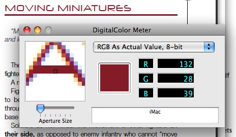
The table below shows the colors of several elements in the books. However, there are a few things that need to be said first. The two most important of these are that first, the colors were determined by using a color meter program on the PDF file of the AT-43 rulebook; this means that they are probably not entirely accurate compared to the colors Rackham actually uses in their layout software.
The second thing is that the colors you see on an uncalibrated computer screen are never the same as those on a printed page; this has many causes, but the end result is that colors on a screen should be used as guidelines rather than as hard rules.
| Element | Approximate color | CMYK | RGB | ||||||
|---|---|---|---|---|---|---|---|---|---|
| Cyan | Magenta | Yellow | Black | Red | Green | Blue | Hex triplet | ||
| Chapter title | White | 0% | 0% | 0% | 0% | 255 | 255 | 255 | FFFFFF |
| Main text | Black | 0% | 0% | 0% | 100% | 0 | 0 | 0 | 000000 |
| Picture caption | Blue | 80% | 55% | 33% | 18% | 60 | 96 | 123 | 3C607B |
| Quotes | Blue | 80% | 55% | 33% | 18% | 60 | 96 | 123 | 3C607B |
| Table border & strokes | Pale gray | 14% | 10% | 8% | 0% | 216 | 218 | 224 | D8DAE0 |
| Table text | White | 0% | 0% | 0% | 0% | 255 | 255 | 255 | FFFFFF |
| Text box header & text | Dark gray | 68% | 72% | 52% | 18% | 95 | 78 | 94 | 5F4E5E |
Some elements, such as headers, are missing from the table above. This is because the colors of these varies depending on the book: for example, the underlined headers in the AT-43 rulebook are a dark red color, while in Operation Damocles these same headers are almost black, and in Operation Frostbite they are blue instead. Likewise, the colors of tables also depend on the book they are in.
A few things that can be said, however are the following:
Following are document templates for a number of different layout programs and word processors. (Note that the styles in these templates use WallaWalla instead of Cholla Sans, so you may want to change them if you have access to the latter typeface.)
This template is for use with Adobe InDesign CS4. You can keep the file in any folder on your hard drive and create a new document by double-clicking its icon or by choosing File → Open… in InDesign and selecting the file.
Alternatively, you can put the template into a folder in /Library/Application Support/Adobe/Templates/<locale>/InDesign/<InDesign version number>/ (Mac) or C:\Program Files\Common Files\Adobe\Templates\InDesign\ (Windows), which allows you to open it via Adobe Bridge or by choosing File → New → Document from Template… in InDesign (which opens Bridge to let you select a template).
File Size: 709 KB (708573 bytes)
MD5 checksum: 4aca5ab500cb16233ba96ea02ee688c5
This template is for use with Apple Pages ’09, which is part of the iWork suite. Although you can keep this file anywhere and create a nameless document by double-clicking its icon in the Finder, you cna also have the template appear in Pages' Template Chooser (⇧⌘N). To do this, open the Finder and go to your home folder; then, from there, open the folder Library/Application Support/iWork/Pages/Templates/My Templates/ and put the template in there. (Note, however, that in a very un-Mac way, this folder will have a different name if you do not have your system's first language set to English in the System Preferences → International, or System Preferences → Language and text in OS X 10.6 Snow Leopard. For example, with Dutch at the top of the list the folder Pages looks for is actually …/Pages/Sjablonen/Mijn Sjablonen/, but because the Pages folder likely contains nothing else than the Templates folder in your preferred language anyway, all you need to do is go to that one.)
File Size: 125 KB (124562 bytes)
MD5 checksum: b61d5d79f688fce216a211c32a7e4b8d
This is not a true template, but an archive with images that you can use to create page decorations, put icons in the text, and so on yourself. These files were obtained by pulling various AT-43 PDF files through File Juicer.
After unzipping the image pack, you will get a folder with a number of subfolders containing the images. You can put all of these anywhere on your hard drive that you want. However, if you move or rename them after using the images in a document, there is a possibility that the program you used will complain that the images can't be found anymore, so you will have to relink to them in whatever way the program lets you do that.
File Size: 1.9 MB (1870856 bytes)
MD5 checksum: 76806e1554b0fef7e00d19aa37087965